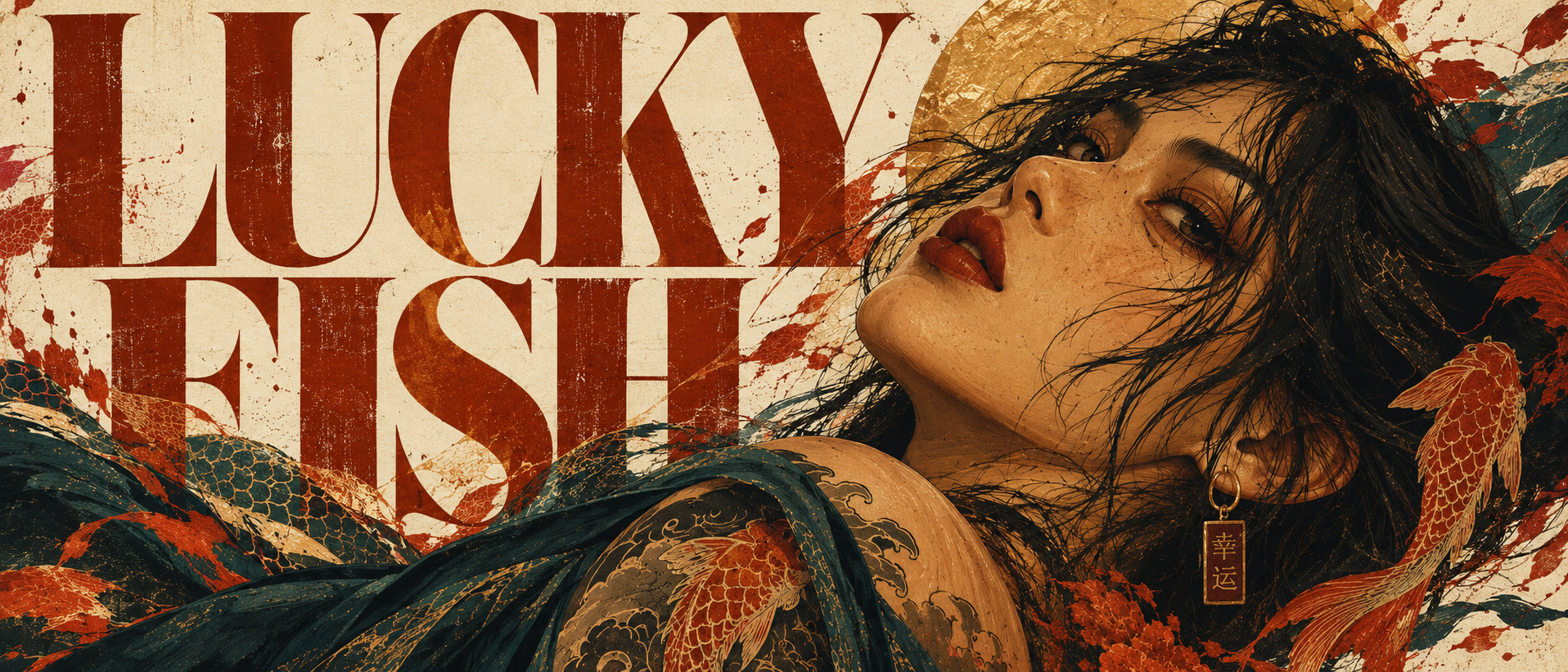
LUCKY FISH
Jewelry, objects, print & visual identity
Independent Concept / Brand Development — New York City
Lucky Fish started as a jewelry idea.
It has since become something much larger.
The original intention was to create the kind of jewelry I actually wanted to wear: thick, tactile pieces in silver and steel with enough personality to be recognizable from across a room. No basic bands dressed up with branding. No delicacy for delicacy's sake. Rings shaped like fish, waves, and animals. Objects that could scratch, oxidize, and change with the person wearing them.
But once I started asking who would wear those objects, Lucky Fish stopped being only about jewelry.
It became about the people around it.
Tattoo artists. Bartenders. Cooks. Musicians. Photographers. Designers. People who care too much about the perfect white T-shirt, a particular pair of boots, an old ashtray, the knife they use every day, the records stacked beside their turntable.
People with small obsessions.
That started the brand.
THE IDEA
Small obsessions make interesting people.
Lucky Fish is built around people who give a shit about things.
Not necessarily expensive things. Not necessarily fashionable things.
Just things they have chosen to care about.
A pair of boots worn until the leather changes shape. A ring that becomes scratched after years of use. A collection of matchbooks from restaurants that no longer exist. Japanese knives. Cowboy boots. Glassware. Tattoos. Records. Coffee. Sardines. Chairs.
Lucky Fish is interested in the relationship between people and the objects they keep around them.
The jewelry is part of that relationship, but it isn't the entire story.
The brand ultimately became less about selling something to a person and more about entering a world they had already built for themselves.
An internal line became useful while developing the project:
It's their world. We're just living in it.
BRAND PRINCIPLES
SMALL OBSESSIONS
Interesting people are interested in things.
Curiosity sits at the center of Lucky Fish. The brand should always be able to wander into another subject simply because it finds that subject interesting.
Food. Tattoos. Music. Objects. People. Cities. Clothing. Craft.
Not everything has to become a product.
Sometimes being interested is enough.
WORN, NOT OWNED
The objects should get better through use.
Silver oxidizes. Steel scratches. Rings get knocked against bars and kitchen counters. Pendants pick up dents. Posters fade slightly in sunlight.
Lucky Fish isn't interested in keeping objects pristine.
The evidence of ownership is part of what makes them interesting.
PEOPLE BEFORE PRODUCT
Lucky Fish shouldn't build people around its jewelry.
The jewelry should enter people's existing lives.
That principle eventually became central to the photography and campaign direction:
Photograph the life wearing the jewelry, not the jewelry wearing the life.
DON'T OVERTHINK IT
Not every object needs mythology.
Sometimes a fish is a fish because fish are cool.
Lucky Fish can be meaningful without constantly explaining itself.
THE LUCKY FISH PERSON
There isn't one archetype.
The Lucky Fish person could work behind a bar, tattoo people for a living, restore motorcycles, cook professionally, make ceramics, photograph strangers, DJ on weekends, or spend their afternoons digging through record stores.
Occupation isn't what connects them.
Particularity is.
They know what they like.
They develop attachments.
They collect things for reasons that might make no sense to anyone else.
And they tend to build environments that reveal who they are before they say anything.
Lucky Fish is confident, physical, curious, slightly eccentric, and unpretentious.
Never delicate for the sake of elegance.
Never rebellious simply because rebellion photographs well.
VISUAL IDENTITY
From the beginning, Lucky Fish needed a visual identity that could exist well beyond a jewelry box.
The symbol had to work:
on a ring,
on a sticker,
on a poster,
sprayed onto a wall,
stamped into steel,
drawn with a marker,
or tattooed onto someone.
That led to the Lucky Fish itself.
Not a clean geometric fish logo.
A strange, expressive creature inspired by tattoo illustration, distorted anatomy, bold silhouettes, and graphic printmaking.
The intention was to create something recognizable enough that eventually the wordmark wouldn't always be necessary.
The fish becomes the mark.
THE FISH
The final direction exaggerates perspective rather than presenting the fish in a conventional side profile.
The head pushes toward the viewer while the body recedes behind it. Large eyes and an almost ridiculous expression stop the symbol from becoming too polished or self-serious.
Its visual language combines:
heavy black structure
tattoo-inspired pattern
distorted anatomy
controlled asymmetry
orange and red
teal
warm cream
rough print texture
The full illustrated fish can become expressive and colorful.
A simplified version can become the hallmark used inside jewelry, packaging, and smaller applications.
The goal isn't merely a logo.
It's a mark.
COLOR
Lucky Fish does not have one cinematic filter.
It has a relationship with color.
Photography can be warm, dirty, saturated, fluorescent, nocturnal, or sunlit depending on the scene.
Graphic work can become much louder.
Tomato red against cobalt.
Burnt orange against pool blue.
Deep teal against warm skin.
Hot pink against butter yellow.
Cream against black.
The rule developed into:
Color serves the scene. The scene doesn't serve the palette.
The connecting quality is richness.
Lucky Fish should feel graded, not muted.
TYPOGRAPHY
The symbol carries much of the brand's personality, which allowed the typography to become heavier and more direct.
Large condensed lettering became an important part of the visual system.
LUCKY FISH can dominate an entire poster.
Sometimes the type identifies the image.
Sometimes it becomes part of the image.
The intention is confidence rather than decoration.
MATERIALS
The jewelry direction began with the materials I personally gravitate toward:
Sterling silver.
Stainless steel.
Stone.
Gold may eventually appear where a design demands it, but it isn't part of Lucky Fish's foundation.
Silver gives the collection character through oxidation, engraving,, and wear.
Steel introduces something harder and more industrial.
Stone gives individual pieces irregularity and color without turning Lucky Fish into conventional fine jewelry.
Potential stones include onyx, jasper, bloodstone, lapis, turquoise, agate and other naturally patterned materials.
There is deliberately no fabricated mysticism attached to them.
Sometimes a stone is interesting because it looks incredible.
PRODUCT DESIGN
A major rule emerged while developing the collection:
If the same thing could be bought somewhere else, Lucky Fish probably doesn't need to make it.
That immediately ruled out the usual assortment of essential bands, plain signets and generic chains.
Lucky Fish jewelry should be recognizable because of its form.
Not because a logo was stamped onto something familiar.
It can be intricate.
It can be detailed.
But it should never become so intricate that the object stops being legible when worn.
Comfort became equally important.
The customer is imagined wearing several pieces together, so even the boldest rings need enough clearance around adjacent fingers to remain practical.
001 — RINGS
LITTLE FISH
A sculptural fish that wraps around the finger.
The head and tail almost meet, leaving a small opening that allows slight adjustment.
The design references a fish ring I once owned, but pushes it further into the Lucky Fish language.
Rather than engraving a fish onto a band, the fish is the ring.
TIGER
One of the defining objects of the first collection.
The original concept was highly sculptural, but early explorations raised an important question:
How much detail can a ring realistically hold before it becomes uncomfortable?
The final direction keeps the crouching tiger recognizable while reducing unnecessary projection and bulk.
Bold enough to read immediately.
Flat enough to wear beside another ring.
THE ROCK
A heavy stone-led ring.
Less polished precious stone, more geological object.
An irregular piece of bloodstone or similarly dramatic material sits inside oxidized sterling silver.
The stone carries much of the personality.
SCALE
A textural ring built from overlapping scale-like forms.
The texture matters more than ornament.
Light should break differently across each raised section as the hand moves.
WAVE
A larger ring designed to climb slightly over the joint.
The surface is formed through layered waves rather than a conventional band.
It is one of the collection's most physical pieces while still being designed around comfortable everyday wear.
DINNER
The collection's more playful sculptural ring.
A sardine wraps around the finger.
The concept deliberately sits somewhere between jewelry and a tiny object.
Lucky Fish doesn't need to take itself seriously all the time.
CHAINS & PENDANTS
The necklace program works differently.
Rather than producing endless chain variations, Lucky Fish focuses primarily on the objects hanging from them.
The chain becomes the infrastructure.
The pendant becomes the personality.
MATCH
A small sculptural matchstick.
The match head carries a rough texture designed to catch light and make the tiny object readable at necklace scale.
It eventually inspired one of the early campaign ideas: coat the end of a prop version in fuel and briefly ignite it like an actual match.
LUCKY COIN
A thick, slightly battered coin.
One side carries the Lucky Fish.
The reverse shows the same fish as a skeleton.
No slogan.
No explanation.
A living fish on one side.
What remains on the other.
DICE
A small metal die.
Rather than trying to hide detailed fish graphics across several tiny faces, the ONE becomes the Lucky Fish eye.
A practical design decision became the strongest conceptual part of the object.
POSTERS
The posters originally began as supporting campaign material.
Then something unexpected happened.
They became some of the strongest objects in the project.
The design test became simple:
Would somebody want this hanging large above a leather couch surrounded by plants even if they knew nothing about Lucky Fish?
If the answer was no, the poster wasn't finished.
That shifted the posters away from conventional advertising.
They became art objects.
POSTER series 001
TIGER
The center of the Lucky Fish visual thesis.
A crouching tiger sits inside an intensely colored environment of orange, red, teal, black, and natural tones.
Large Lucky Fish typography occupies the composition without turning the image into an advertisement.
This poster established the standard:
Art first, brand second, advertisement almost not at all.
BACK TATTOO
A woman stands full-body in her apartment with her back turned toward the viewer.
She wears jeans.
Her arms stretch above her head as though she has only just woken up.
A ray of light crosses the room and catches the large tattoo covering her back.
The image isn't selling jewelry.
It's depicting someone Lucky Fish hopes to reach.
FOGGED MIRROR
A tattooed woman stands in front of a bathroom mirror.
Her reflection becomes partially obscured by condensation, dirt, scratches and graphic texture.
The poster explores identity and observation without requiring a product to become the focal point.
SUBWAY
Late-night New York.
A solitary figure sits across the orange subway seats, exhausted and completely comfortable taking up space.
The image captures one of the fundamental Lucky Fish campaign ideas:
Catch people halfway through something.
Halfway home.
Halfway through a cigarette.
Halfway through getting dressed.
Halfway through a shift.
Lucky Fish rarely photographs arrivals.
It photographs the in-between.
DINNER
A table after dinner.
Sardines.
Bread.
Wine.
Lemon.
Tomato.
A knife.
Flowers.
Crumbs.
Everything is treated with the dramatic seriousness of an old still-life painting.
The humor comes from giving something ordinary almost mythological importance.
Which is, in many ways, what Lucky Fish is about.
PRINTS AS PRODUCTS
The poster program eventually changed the practical strategy behind Lucky Fish.
Producing an entire jewelry collection properly requires significant capital.
Launching only one or two pieces could make the brand possible sooner, but it would tell only a fraction of the story the collection was designed to tell.
Instead of compromising the jewelry, Lucky Fish can begin somewhere else.
With the world itself.
The current direction is to launch Lucky Fish initially through prints.
Not as a "poster company."
Not as merchandise used to fund a jewelry brand.
But as the first physical objects from the Lucky Fish universe.
The jewelry is visible from the beginning through drawings, prototypes, material studies and development.
When it is ready, it becomes another object within a world people already understand.
001 AS AN ERA
This also changed how Lucky Fish releases are structured.
Rather than:
001 = one product drop
the current thinking is:
LUCKY FISH / 001
An entire creative period.
Within it:
001 / PRINTS
followed eventually by:
001 / JEWELRY
and potentially other objects where they make sense.
Only when the world itself changes does Lucky Fish move into 002.
THE POSTER-FIRST LAUNCH
The first commercial release is currently imagined as approximately 8–10 posters, all produced at the same size so they can be collected and hung side-by-side.
The first seven directions currently include:
Tiger
Back Tattoo
Fogged Mirror
Subway
Dinner
Negroni
777
The remaining pieces are being developed to broaden the world without breaking the visual language of 001.
Future series can adopt entirely different styles.
001, however, remains visually rooted in the cinematic, painterly, color-rich language that established Lucky Fish in the first place.
CAMPAIGN
The campaign began with three emotions:
Intrigue
Drawn In
Curiosity
In that order.
Lucky Fish shouldn't immediately explain itself.
Someone sees an image.
They stop.
They become interested.
Then they start wondering what Lucky Fish actually is.
Campaign images show different people in moments of transit rather than traditional product poses:
a bartender outside after work,
someone tying leather boots,
a tattoo being finished in an apartment,
a couple sitting on the subway after a night out,
someone drinking their first coffee of the day.
The jewelry exists inside those lives.
It does not interrupt them.
SMALL OBSESSIONS
Lucky Fish eventually developed an editorial format capable of carrying the brand far beyond product photography.
SMALL OBSESSIONS — A LUCKY FISH SERIES
Each piece focuses on one person and one thing they care deeply about.
Someone with seventy-three vintage matchbooks.
A cook obsessed with Japanese knives.
A bartender collecting strange glassware.
Someone who spent ten years finding their perfect white T-shirt.
A tattoo artist with hundreds of records.
The format could exist as:
short films
photography
interviews
zines
essays
The jewelry may appear.
It may not.
The point is genuine curiosity.
VOICE
Lucky Fish doesn't need to sound profound every time it speaks.
The voice is direct, confident, dry when appropriate and occasionally strange.
Avoid:
"Crafted for those who dare."
"Modern talismans."
"Timeless pieces inspired by imperfection."
"Jewelry for rebels, dreamers and outsiders."
Lucky Fish doesn't need to manufacture a personality for its audience.
They already have one.
A product description could simply say:
THE BIG FISH
Sterling silver.
It's a fairly big fish.
That's why we called it that.
Or:
Silver changes. So will this. Wear it anyway.
That feels much closer to the brand.
NEW YORK
Lucky Fish begins in New York City.
Not because the brand needs New York iconography everywhere, but because the city naturally informs the people, environments, and rituals surrounding it.
Subways.
Apartments.
Restaurant back doors.
Tattoo studios.
Bars.
Laundromats.
Fire escapes.
Sidewalks.
The city isn't a graphic device.
It's where Lucky Fish lives.
WHERE IT GOES
Lucky Fish began as jewelry.
The process of developing it revealed something more useful:
The category doesn't need to define the brand.
Today it might make rings.
Tomorrow it could make posters.
Eventually it might make another object simply because that object belongs in the world.
A lighter.
A pair of sunglasses.
A strange little sculpture.
A book.
None of those directions need to happen.
The point is that they could.
Because the connective tissue isn't the product category.
It's taste.
Curiosity.
Attention.
And the people Lucky Fish is interested in.
LUCKY FISH
Small obsessions make interesting people.
New York City.
Ongoing.